How should we organize our React projects?
December 11, 2025 • 10 min read
A lot has changed since I wrote this. I would not recommend strictly adhering to this pattern, especially if you’re building with AI.
If you’ve worked in a modern React project before, then you’ve probably seen something like this:
Where files are sorted based on the type of code they contain. Hooks live with other hooks, components with other components, etc.
For simple projects, this tends to work fine. But as your codebase scales, you end up with low feature cohesion. Making changes to one area of your app requires editing multiple files scattered far and wide across different directories.
To see this in action, let’s take a look at a project with a bit more complexity: a messaging app.
If you want to make changes to the way messages work in this app, you may need to access components, hooks, contexts, types, and who knows what else. These things all live in separate files & folders, with the only indication that they are related being that:
- they all hopefully have message somewhere in their name
- they might import from each other.
So what can we do?
Let’s make a new rule: if a feature has different types of code that previously
would have been spread across our project, we will instead create a dedicated
folder for that feature. For example, all the code for messages will now live in
📁/features/messages
Let’s try this, and see how things look.
Much better. Now when you want to make changes to messages, you only have to
look in one place: 📁/features/messages
So is that it? Are we done?
We could be. This pattern can take you far. Keeping code for related features close together will make things much easier to manage as you scale your app.
But I think we can do even better.
Let’s take a closer look at our components folder. It’s common to have a
dedicated folder for components from shadcn registries1. These are usually
found in 📁/components/ui
My issue with this convention is that it doesn’t draw clear lines with regard to where code should belong.
- Does having some of the component files in
📁/uimean that the others aren’t UI? - Since it’s the components folder, that means that all of this is component code, right?
Typically, the answer to both of those questions is no.
Below is the first 30 lines of the sidebar component from the official shadcn registry. As we can see, it defines constants, a type, a context, and a hook before we get to any component code.
// components/ui/sidebar.tsx

const SIDEBAR_COOKIE_NAME = "sidebar_state";
const SIDEBAR_COOKIE_MAX_AGE = 60 * 60 * 24 * 7;
const SIDEBAR_WIDTH = "40rem";
const SIDEBAR_WIDTH_MOBILE = "100vw";
const SIDEBAR_WIDTH_ICON = "3rem";
const SIDEBAR_KEYBOARD_SHORTCUT = "b";

type SidebarContextProps = {
  state: "expanded" | "collapsed";
  open: boolean;
  setOpen: (open: boolean) => void;
  openMobile: boolean;
  setOpenMobile: (open: boolean) => void;
  isMobile: boolean;
  toggleSidebar: () => void;
};

const SidebarContext = React.createContext<SidebarContextProps | null>(null);

export function useSidebar() {
  const context = React.useContext(SidebarContext);
  if (!context) {
    throw new Error("useSidebar must be used within a SidebarProvider.");
  }

  return context;
}
So then what should we do? Should we move all of this code into separate files
and put them in a new folder in 📁/features?
We could.
Is sidebar really a feature though? Looking over the docs for it, you can see that it’s more like a collection of building blocks. These can then be used to build your actual sidebar tailored to the specific needs of your app.
I think the sidebar code needs a new home, somewhere different than our features folder. Which brings us to our next topic: Atomic Design.
Atomic Design is a book written by Brad Frost. It outlines best practices for building UI by defining 5 different categories: Atoms, Molecules, Organisms, Templates, and Pages.
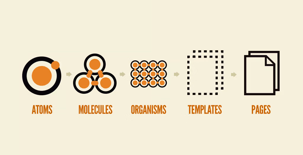
Brad wrote a short article going over what defines each of these categories, but to summarize:
- Atoms are the smallest building blocks (buttons, labels, inputs)
- Molecules are composed of atoms (search bar, product card)
- Organisms are composed of molecules (masthead, product grid)
- Templates stitch organisms together
- Pages are specific instances of Templates
Despite being written over a decade ago2, this methodology aligns surprisingly well with the way we’re already building in React today.
In the words of Katia Wheeler:
React, at its core, follows Atomic Design inherently by encouraging developers to keep components as simple and as broken down as possible. From this simplicity, we can create more complex components and containers of components to create the user interfaces of our applications.
I figured the best way to see how I truly feel about this mental model would be to try it out myself. I decided to build the messaging app3 we’ve been outlining, strictly following the principles of Atomic Design.
Issues arose early on in the project. I found it difficult to decide whether certain components should be classified as molecules or organisms. I also didn’t have many components that fit Brad’s definition of an atom. This led me to the realization that maybe the best route is to adopt the sentiment of Atomic Design, adjusting the definitions to better fit the needs of React.
To start, I decided not to embrace his idea of pages and templates. I think
the best course of action here is to stick to whatever the meta-framework you’re
building in prescribes. For example, layout.tsx and page.tsx in
Next are fairly
analogous to templates and pages, so I think I’ll just stick with those for now.
I also decided to get rid of organisms, leaving atoms and molecules as the units to measure the complexity and size of components. My updated rules aren’t perfectly aligned with their relationship in chemistry, but it’s close enough that the analogy is still useful.
Atoms
- Should be conceptually simple and reusable
- Can contain any kind of code, multiple components per file is encouraged
- ✅ Can be built with other atoms
- ❌ Cannot be built with molecules
- ex: button, sidebar, list, card, message
Molecules
- Tailored to a specific use case, but possibly reusable across different areas of your app
- Can contain any kind of code, typically one component per file
- ✅ Can be built with atoms
- ✅ Can be built with other molecules
- ex: message list, search bar, admin sidebar, analytics sidebar
This modified analogy allows components from shadcn to fit perfectly into the category of atoms. You download atoms like button, sidebar, input, and then use them to build the molecules that solve problems specific to your app.
Let’s go ahead and move all of these shadcn components from 📁/components/ui
into a new folder: 📁/atoms
Earlier I mentioned that the sidebar atom is quite large, containing hundreds of lines of code. If you’d like to split it up, feel free to do so by creating a sidebar folder and separating the code by type. I tend to do this when an atom includes a context.
The use of barrel files in app code is controversial, and they can certainly cause issues. But I think using them to bundle exports for atoms you’ve split up is a valid use case.
// atoms/sidebar/index.tsx

export * from "./sidebar-components";
export * from "./sidebar-context";
Now when you use your atom to build molecules you can get all of the atom’s code from one import, while keeping its code in separate files.
// molecules/admin-sidebar.tsx

// import { Frame, Content, MenuItem } from "@/atoms/sidebar-components";
// import { Provider } from "@/atoms/sidebar/sidebar-context";

// ✅ wild card import from barrel file
import * as Sidebar from "@/atoms/sidebar";

const AdminSidebar = () => {
  return (
    <Sidebar.Provider>
      <Sidebar.Frame>
        <Sidebar.Content>
          <Sidebar.MenuItem>Dashboard</Sidebar.MenuItem>
          <Sidebar.MenuItem>Analytics</Sidebar.MenuItem>
          <Sidebar.MenuItem>Reports</Sidebar.MenuItem>
        </Sidebar.Content>
      </Sidebar.Frame>
    </Sidebar.Provider>
  );
};

export { AdminSidebar };
Great! We’ve given all of our shadcn4 components a new home. What about the components we wrote ourselves? What should we do with those?
Let’s take another look at the feature folder we created for messages:
Currently, we have three different kinds of message:
user-message.tsxassistant-message.tsxsystem-message.tsx
And message-list.tsx to string them all together.
Our different types of messages almost certainly have similarities, parts of their code that may even serve identical purposes. If we split that code out into reusable pieces, then it could be shared among our different types of messages.
Let’s create a message atom5, containing small reusable components that our message variants share. We can then use this atom to compose our three message variants as molecules.
// features/messages/molecules/user-message.tsx

import type { EnhancedMessage } from "@/features/messages/types";
import * as Message from "@/features/messages/atom";

const UserMessage = ({ message }: { message: EnhancedMessage }) => {
  return (
    <Message.Provider message={message}>
      <Message.Container className="mt-3">
        <div className="flex gap-3">
          <Message.PFP />
          <Message.Body>
            <Message.Header />
            <Message.Content />
            <Message.Reactions />
          </Message.Body>
        </div>
        <Message.Actions />
      </Message.Container>
    </Message.Provider>
  );
};

export { UserMessage };
When combining the power our new message atom with more general purpose atoms like list and scroll, it becomes simple to compose something like the message list molecule shown below.
// features/messages/molecules/message-list.tsx

import type { EnhancedMessage } from "@/features/messages/types";
import * as Message from "@/features/messages/atom";
import * as List from "@/atoms/list";
import * as Scroll from "@/atoms/scroll";

const MessageList = ({ messages }: { messages: EnhancedMessage[] }) => {
  return (
    <Scroll.Wrapper>
      <Scroll.Container fade="sm">
        <List.Skeletons position="aboveContent" className="pt-4" />
        <List.Items className="pb-4">
          {messages.map((message) =>
            message.type === "user" ? (
              <UserMessage message={message} />
            ) : message.type === "assistant" ? (
              <AssistantMessage message={message} />
            ) : message.type === "system" ? (
              <SystemMessage message={message} />
            ) : null,
          )}
        </List.Items>
      </Scroll.Container>
      <Scroll.ScrollToBottomButton />
    </Scroll.Wrapper>
  );
};

export { MessageList };
Let’s take another look at our messages feature folder now that we’ve restructured our code:
That’s it! Putting atoms and molecules into feature folders is the last piece of the puzzle. Let’s see how things look after applying our new Atomic Design principles to every corner of the app:
By following these principles:
- Grouping code for features close together
- Building atoms, and then using them to compose molecules
We have dramatically improved the readability, maintainability, and composability of our project. Adopting this practice6 will put you on a path towards consistent UI and improved code clarity.
Enough from me, I want to know what you think. Would you consider adopting this pattern into your projects? If not, what issues do you see with it? What would you do differently?
Footnotes
Footnotes
-
Most people think shadcn is a component library. While I suppose this is technically true, it only gives you half the picture. Shadcn is a person, who built a standard for building component libraries (naming the standard after himself). His personal component library built with this standard is very popular, and is why most people think it is just your everyday component library. But it is more than that. This distinction is important because I wish more people knew about this and used the standard to build their own component libraries. ↩
-
Brad and team worked on Atomic Design between 2013 and 2016, so at the time of writing this (December 2025) some of the content has not yet reached its 10th birthday. ↩
-
The result of this endeavour is the chatroom / discussion board thing in the sidebar on the left side of your screen. As I continued building and collected more opinions on this topic, I started writing them down. Eventually, I decided to make this whole thing into a blog website, with those opinions as the first post. Here we are. ↩
-
Don’t forget to modify
components.jsonto have all new component code saved into the atoms folder. ↩ -
I won’t include code snippets for any of the atoms I’ve built since they’re all fairly large. If you’re interested in reading through them, check out the repo for this project. ↩
-
For those looking to better understand the power of building this way, I highly recommend you watch Composition Is All You Need, an excellent talk by Fernando Rojo. ↩